By: Renato Miguel do Carmo and Ana Rita Matias

Gini Coefficient
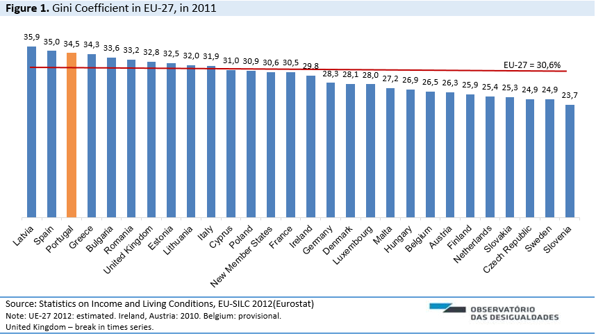
In 2011, Portugal, with a Gini Coefficient of 34,5% was still above the EU-27 average (30,4%), being with Latvia and Spain (35,9%, 35%, respectively), the European countries where income distribution is more unequal.
Slovenia continues to be the country where the Gini Coefficient is the smallest, 23,7%, followed by Sweden, Czech Republic (both with 24,9%) and Slovakia (25,3%).
In comparison with 2009, the EU average rose 1 percentile point – in the Portuguese case that aggravation was 0,8 pp. Countries that standout: Lithuania sees, between 2009 and 2011, its Gini Coefficient drop down from 36,9% to 32% (-4,9 pp), going from the 1st to the 9th place; Hungry went from 24,1% to 26,9% (+2,8 pp), climbing from 26ª to the 20ª position.

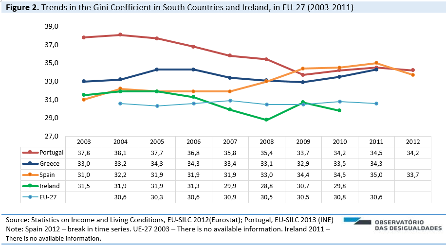
Figure 2 shows the evolution of the inequality indicator in Portugal, Greece, Spain and Ireland, between 2003 and 2011. The effect of the crisis is clear for the first three countries. Ireland’s situation starts getting better right in 2010. For the South Counties it’s after this year that the rise in the inequality becomes more evident.
In this regard, note that Spain had a considerable increase in inequalities from 2007 onwards, surpassing in 2009 Portugal’s value (which was reducing between 2005 and 2009). It’s also interesting to see that in 2011 all the three southern countries hit a similar value in this indicator, though the latest results for Spain show a decrease in inequality (1,3 points)

The richest 20% of the population relative to poorest 20% (S80/S90)
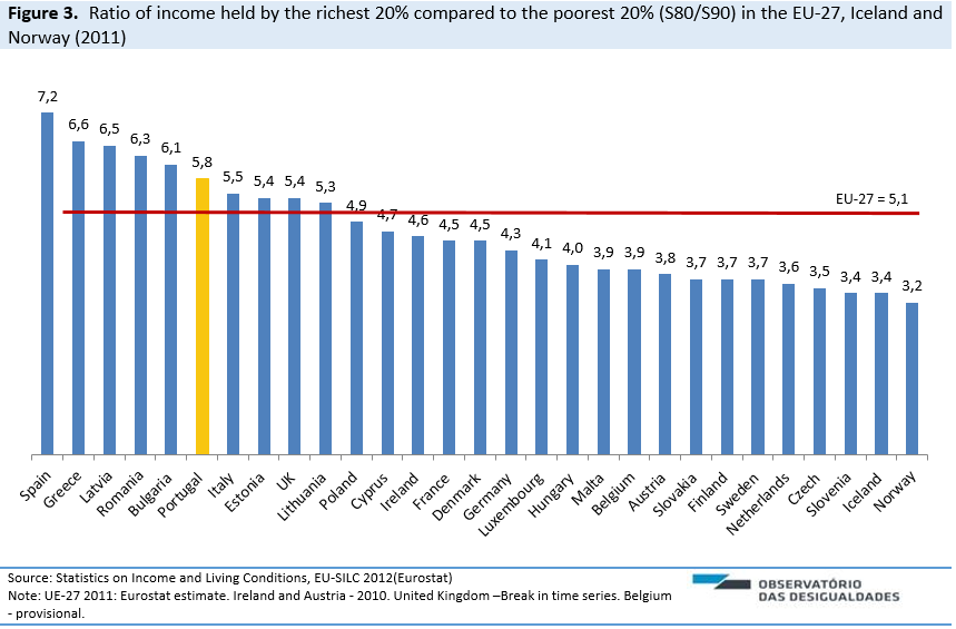
The S80/S20 is a “percentile ratio” calculated as the ratio of total income received by the 20% of the population with the highest income to that received by 20% with a lowest income level.
In 2011, the disposable income of the richest 20% in Portugal (the top quintile) was 5,8 higher than the income of the poorest 20% (the bottom quintile). Considering the set of European countries analysed in Figure 1, Spain had the highest value of this measure (7,2), just followed by Greece (6,6), Latvia (6,5) and Romania (6,3). Norway (3,2), Iceland and Slovenia (both with 3,4) are the countries that present the lowest levels of income inequalities between the two quintiles (Figure 3).
As can be seen, much of the countries that have by comparison low levels of economic inequality are from the north of Europe. Also, among the east countries we observe very different profiles between the most unequal (Estonia, Latvia, Romania, Bulgaria and Estonia) and the less unequal (Slovenia, Czech Republic and Slovakia).

Figure 4 contains information regarding the S80/S20 evolution in southern countries and Ireland, in EU-27, already with information for 2012 about Portugal and Spain. In Portugal, between 2004 and 2009 there was a sustained inequality reduction, but we observe a changing trend in the last years. Since 2010, the ratio between the richest 20% and poorest 20% increased every year, aggravating this measure in 0,3 percentage points. Also in Greece there was a shift in trend starting 2009. Between 2010 and 2011 the S80/S20 increased 0,6 points. In Spain, between 2003 and 2011, the ratio rose 2 points. It also should be pointed out that in 2012, Spain, unlike Portugal, decreases the value of this indicator in 0,9 points.
In these group of countries, although with some fluctuations, Ireland is the only one that stays always below EU-27 average.

The richest 10% of the population relative to poorest 10% (S90/S10)
An overview of the income distribution trend in Portugal, between 2010 and 2012, shows that the measure S90/S10 rose 1,3 p.p., reversing a trend of inequality reduction (Fig. 5).
The S90/S10 is calculated from the difference between the income received by the 10% of the population with the highest income (the top decile) to that received by the 10% of the population with the lowest income (the bottom decile).
In 2012, the income of the wealthiest 10% was 10,7 times higher than the income of the 10% least wealthy (which represents an increase of 0,7 percentage points comparing with 2012). Portugal doesn’t reach such a high value in this indicator since 2006.

GDP per capital in PPS and Human Development Index
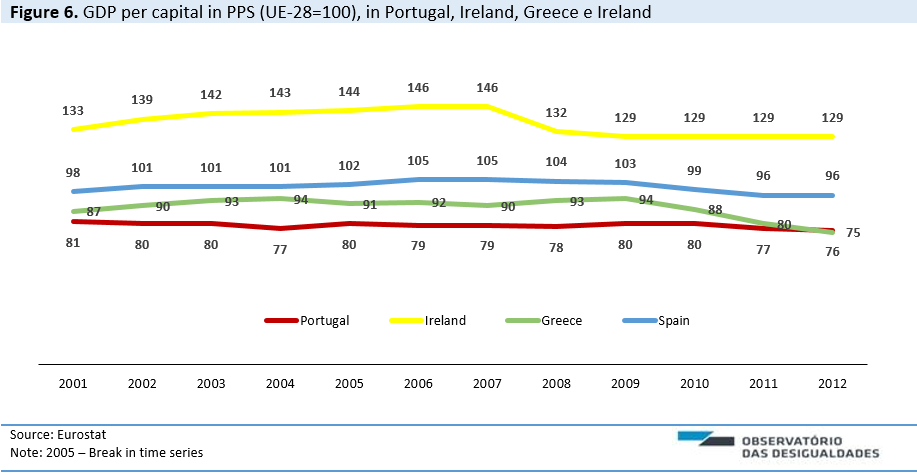
Figure 6 shows the evolution of the GDP per capital in PPS. Between 2001 and 2012, it’s clear the effect that the crisis had in the last three years on Portugal, Ireland, Greece and Spain. In the Irish case, after a moment of sustained increase in this indicator, there was a trend reversal starting 2008.
Spain, compared with Portugal and Greece, has always had a better relative position in relation to the European GDP average. After a declining trend which begins in 2008 and worsens in 2010 (a drop of 4 points in only one year), the latest results are anchored at 96% of the EU average.
Portugal was the country with the lowest variability of GDP per capita in this period. Still, in the last two years the trend is downward – in 2012, Portugal, with a value of 76%, sees a reduction in this indicator, compared to 2010 and 2011, of 4 and 1 points, respectively.
In Greece, the impact of the recession on the product begins in 2010 and was consecutively aggravated until 2012 (a drop of 13 points).

The proportional decrease in percentage of GDP per capita, is one of the most severe consequences of the recent period of austerity and economic recession seen in the compared four countries. This decrease in the product could be partly explained by the stagnation observed in the Human Development Index, this after a moment of positive development until 2010 (Fig. 7).

Originally published in Inequality Watch, 2014

